Thursday, October 24, 2013

Halloween Assignment!

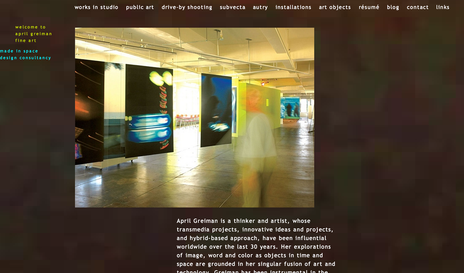
   Getting this project today actually made me very excited. The assignment was to pick from a list of well-known classical and modern graphic designers, illustrators, photographers, etc...and to make a small (2-3 minute) presentation about them. The fun part about it, is that when we present we are supposed to dress up like that artist! Since I'm majoring in graphic design, I chose an artist from the graphic design list. I chose April Greiman. I researched a few different designers before finalizing who I wanted to do the assignment on, and they were all so unique. All of them had different characteristics that made them stand out and you could also see those unique qualities in most of their work. I was able to easily chose Greiman because of her website and her work, mostly. I first looked up her name and her website came up first, so I went to it. The first thing I noticed was the background and how it was slightly moving. I thought that was a really cool touch that went together really well with the font that she used for all of her headings and body text. The image on the right is a screen shot of her website, to show you the feeling of her site and even her work!


The image to the left, is a screen shot of Greiman's blog. This is the first post under the thinking tab on the left, and I was intrigued by the depth of her thinking. I really enjoyed going through and looking at her blog because it helped me take a look in her life and see what she is thinking and doing on a day to day basis of her design career. I am anxious to start this presentation and very excited to start learning more about her.


http://aprilgreiman.com/

Wednesday, October 23, 2013

Parts of the Letter Reading

This reading was very interesting, I've always had a spark of curiosity about typography and the origin of different fonts, so I really enjoyed this! Some of the terms I didn't know, but do now, are below with the definitions. While reading this, I was able to learn more than just what a sans serif and a serif typeface was. I was able to really dig deeper and learn more about every part of a letter. Seeing this has made me realize how much work and effort goes into the making of a font- let alone a single letter! Also, while I was doing this reading, I found a website that has all of these typography definitions and then some! It is also a really cool typography website in general.

http://www.typographydeconstructed.com/category/type-glossary/


Serif: the short strokes that finish off the major strokes of a letter form.
Bracket: the curving joint between the serif and the major stroke.
Baseline: the imaginary line defining the visual base of the letterform; all letterforms sit on the baseline.
Cap Height: the height of the uppercase in a font taken from the baseline to the top of the character.
X-Height: the height of the lowercase "x"; if you compare typefaces of the same point size they may not x-height.
Ascender: a stroke on a lowercase letter that rises above the x-height.
Descender: a stroke on a lowercase letter that falls below the baseline.
Apex: a point at the top of a character where two points meet.
Cross Bar: the horizontal stroke in letters; can be horizontal or sloped.
Vertex: the outside point at the bottom or top of a character where two strokes meet.
Final: a tapered or curved end.
Terminal: the end stroke that does not include a serif
Bowl: the rounded form that describes a counter; it may be open or closed.
Counter: the negative space within a letterform, either fully or partially closed.
Eye: much like a counter, the eye specifically refers to the enclosed area in the letter "e".
Barb: the half serif finish on some curved strokes such as the letter "C", "G", and "S".
Spur: a small projection off a main stroke.
Link: the stoke that connects the bowl and the loop.
Ear: a small stroke extending from the upper right side of the bowl of the lowercase "g".
Loop: the enclosed or partially enclosed counter below the baseline of a double story "g"; also seen in "p", "b", "l".
Tail: a descending stroke (often decorative); the back, last, lower, or inferior part of something.
Arm: the horizontal or upward sloping stroke that does not connect to a stroke or stem on one or both ends.
Crotch: an acute inside angle where two strokes meet.
Stem: the vertical, full-length stroke in upright characters.
Leg: the short, descending portion of a letter.
Friday, October 11, 2013

Understanding Comics- Reflection

   There were two chapters of comics we needed to read for class. I surprisingly learned a lot about cartoons through them, and actually enjoyed reading the chapters instead of just lethargically scrolling through, not really interested; like I thought I would be. There were the general topics talked about all throughout chapter 2 like icons (specifically the face), and why cartoons are so simple in their design and characters. Because of the simplicity, the reader/viewer is more likely to be able to relate with that character. The speaker cartoon himself was very basic and said that if he were more realistic; we would be less likely to read it. I would agree and disagree with that statement however, because I think it all really depends on the audience and the person. There could be that one person that pays really super close to detail and is more intrigued by detailed images than a simple line drawing. 

   There are two worlds we relate with; the physical and the conceptual. Holding many different emotions, thoughts, and links with each other. In the next chapter, it addressed lines and the expressions they used. A line, shaped and modeled in different directions and forms, can portray different emotions and feelings. The different curves of lips, the way the eyebrows arch or don’t arch, the posture, etc. They can be shaped to look realistic or something very unrealistic in cartoons. These unrealistic symbols, such as the lines often seen darting from behind what is supposed to be a car that is going very fast, are invisible ideas. They don’t exist in real life, but have been accepted into our vocabulary and thought process, so that when we see them, we know why they’re being put there. I liked learning about the comics and really hope to someday dig a little deeper into the origins and different concepts of comics!

Thursday, October 10, 2013

IDEO Movie- Reflection


   This video was very informative and gave all of us students a look into what being in the design world was really like. It was watched at the very beginning of our project, so the subject matter being re-designing something was very suitable. A group of professionals were put together and were to re-design a shopping cart. Shopping carts have just always been the way they are so it seems to me like it would be very difficult to try and change it. They went through basically the same process that we have for our project. They brainstormed and then each made prototypes showing their ideas for re-designing the object. The most innovative concepts from each were then taken and merged into one. The key to re-designing the cart was to list all of the problems that the original had. In the movie, the problems were: they are frequently stolen, they are bulky to take down aisles, and checking out took a while. The wanted to fix these problems by: making the cart just a frame with baskets, to make it less likely to be stolen, also the baskets in the cart were to be removable to take down the aisles and then put back into the cart, and they made a scanner so you could scan your items as they were placed in the cart and then the cashier takes it from there. They really thought outside the box and were able to produce a very innovative, new look for the typical shopping cart.

   We wanted to use the same process for our prototype seeing that it worked pretty well with theirs. The problems with our pair of tongs were: it was all metal so it was pretty likely that you could burn your hand if you were trying to handle hot food, the durability was not very good, and the holes for your fingers was not very comfortable. After brainstorming in class, making mind and word maps, and sketching, we were able to come up with a new design for the tongs. We made it so that it will have a heat resistant grip so that you don’t burn yourself, and it will have a spoon and a fork so that it can handle food better, and lastly it will be made out of a different material that is still as durable as metal. The IDEO movie helped a lot to see where we needed to start with the project and what we needed to be doing in order to come up with the best re-design for tongs possible!

Tuesday, October 8, 2013

"Objectified"- Movie Reflection


   Objectified is a documentary directed by Gary Hustwit who is also known for making the documentary Helvetica. Hustwit taught us about the art of typography with Helvetica and here he teaches us about the art of industrial design. Objectified reminds us that every object we see has been carefully industrially designed whether it be a post-it note, a fork or a toothpick. There are stories behind it and many decisions were made, which we don’t always think about. “Every object has a story” a quote from Henry Ford which is the long story short of the documentary. It gives us an inside look at industrial designers from Apple, BMW, IDEO and more about why certain objects are designed a certain way. Something as simple as a toothbrush handle has been strategically thought about and designed for the masses. 
   Jonathan Ive is the famous Senior VP of Industrial Design at Apple and he recalls the first time that he saw an Apple product because he remembers that he got a sense of who the people were that designed it. Ive agrees that the best design is one that feels un-designed to the point where you do not know how it would be designed any other way because there is nothing left but the obvious. By removing the unnecessary elements in an object you get down to the core, this is what makes it absolute. 
   Karim Rashid, a designer from New York, shows how cameras were first designed around the film. Now we have digital cameras that don’t use film, but are still the same basic shape. He questions why we feel the need to keep re-designing the same design over and over again.  The documentary then shows how designers are trying to design for the future and how they’re thinking ahead. Designers know that people usually want a refreshing and renewed look to objects. However, because designers still go through that process, what’s new for fall could mean absolutely nothing by the time spring comes around. Giving designers the goal(s) to make something that looks like what will be “in” in the future, and then they repeat the process over and over again.
   In Objectified we see ordinary objects and the design behind them. It is fascinating how much design goes into a chair and at the same time after tons of chairs are produced, there are still uncomfortable chairs caused by poor design. I may be biased since I am a graphic designer but the documentary was completely intriguing, even though it was focused around industrial design.

Friday, October 4, 2013

Writer's Toolbox Reflection

This reading was important due to the fact that it revolves around the idea of creating a map/list to order or organize your thoughts and come up with new ideas. This reading covered five different ways to help get your creative juices flowing; Mind Maps, Concept Maps, Free-Writing, Brain-Writing, and Word Lists.
   *Mind Maps - This is when you start with the main idea in the center and branch out with different words the main idea/topic makes you think of. Then, as you are thinking of more words, more branches are added. The words/phrases will gradually start to not really relate to the main idea that we started with, but good ideas come up that you may never have thought of before.
   *Concept Maps - In this version, it starts at the top of the page with the main idea and more bubbles are branched downwards. This is different from a mind map because it requires a proposition in between the two ideas. This map can also come up with many great ideas.
   *Free-Writing - This one, rather than a map, is more writing; similar to a journal. The idea is to not stop working for around 10-15 minutes while simply everything on your mind is written down, preferably about the subject. After that time is up, looping is done where the best idea from the first free write is taken and then you start a new free write for another 10-15 minutes with that idea as the subject now. This makes you write down the ideas that could be subconscious thoughts. 
   *Brain-Writing - This concept is mainly to provide for the shy people that may be in a group. It’s similar to brainstorming but with multiple people, and a sheet of paper is passed around. This paper consists of multiple columns and rows and the person writes down the three best ideas they have and then the paper is passed. The point is to have other group members getting ideas off of your ideas and others ideas, etc.. 
   *Word List - This is simply a list of words that reflects all the different words that can tie together with the main idea that you started with. Reading this over and over, will help you finalize your decision.

Overall this reading was very helpful in showing me all the different options for visually sorting my thoughts and producing a great idea, and something that I may not have thought of without the maps!