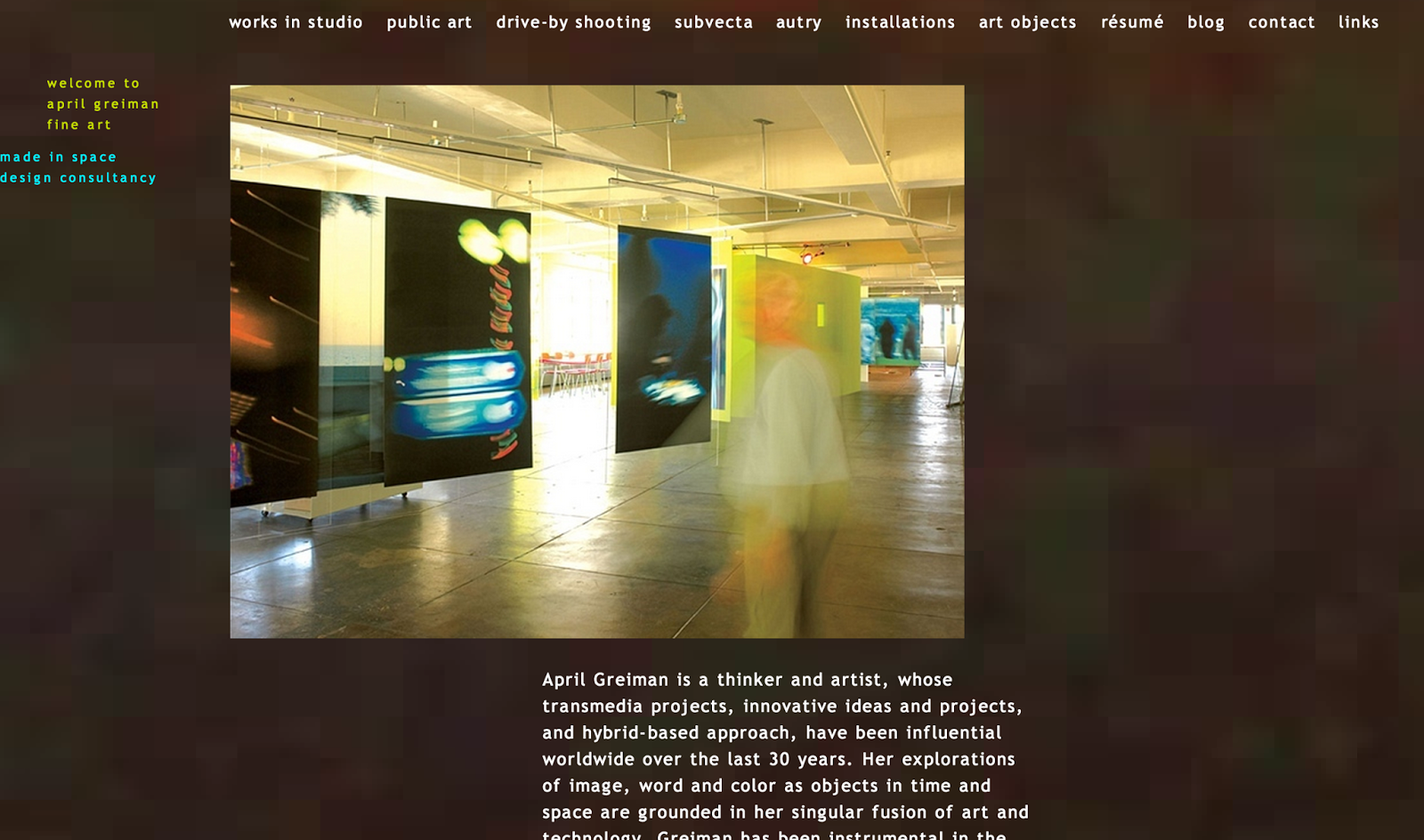
Getting this project today actually made me very excited. The assignment was to pick from a list of well-known classical and modern graphic designers, illustrators, photographers, etc...and to make a small (2-3 minute) presentation about them. The fun part about it, is that when we present we are supposed to dress up like that artist! Since I'm majoring in graphic design, I chose an artist from the graphic design list. I chose April Greiman. I researched a few different designers before finalizing who I wanted to do the assignment on, and they were all so unique. All of them had different characteristics that made them stand out and you could also see those unique qualities in most of their work. I was able to easily chose Greiman because of her website and her work, mostly. I first looked up her name and her website came up first, so I went to it. The first thing I noticed was the background and how it was slightly moving. I thought that was a really cool touch that went together really well with the font that she used for all of her headings and body text. The image on the right is a screen shot of her website, to show you the feeling of her site and even her work!


The image to the left, is a screen shot of Greiman's blog. This is the first post under the thinking tab on the left, and I was intrigued by the depth of her thinking. I really enjoyed going through and looking at her blog because it helped me take a look in her life and see what she is thinking and doing on a day to day basis of her design career. I am anxious to start this presentation and very excited to start learning more about her.
http://aprilgreiman.com/


No comments:
Post a Comment